July 2025
WELCOME
Welcome to The Crazy Plan where our mission is to show that anyone can create unimaginable wealth.
Each month, we publish a blog providing readers with the financial education needed to set out on their own journey to a bright financial future. We do this by following two plans, our Monthly Plan saves £50 a month for 10 years and our Lumpsum Plan starts with a one-off £10,000. Our aim is to turn each plan into $1 billion in one or two generations.
At first, making $1 billion seems crazy but once you realise it’s a journey then things change. We’ll save our first £50 and from there our wealth will build to $1,000, then $5,000, then $10,000 and then $50,000. One day, if we’re patient, we’ll have $100,000 and then we’ll be looking at $1 million. From there it will be onwards to our $1 billion goal. This journey of small steps is how what seems impossible becomes possible.
You can dig-in to our posts however you like or if you are completely new to investing, you may want to start with “1.0 Liftoff!” and go through them in order which is how we build the education. We hope to provide you with the knowledge needed to set out on your own journey to a bright financial future if you choose. You can also visit the “About” page on our website to learn more about our plan.
All readers must read and agree to our Terms & Conditions, including the Disclaimer, which can be found on the T&C page of our website: https://thecrazyplan.com
ON WITH THE PLAN
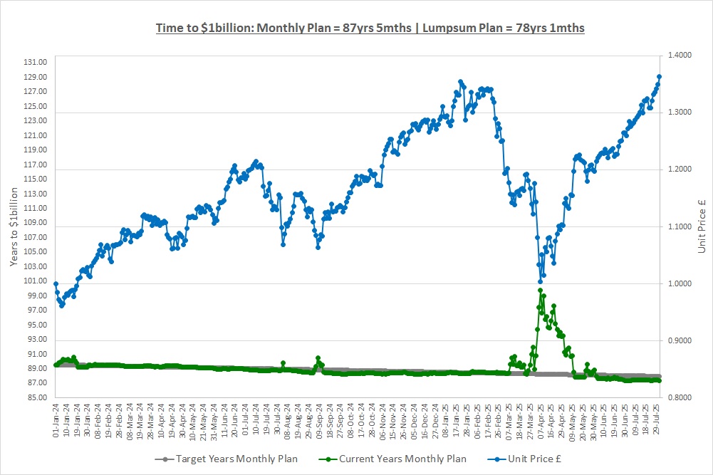
Our Lumpsum Plan will be worth $1billion in: 78yrs 1mth
Our Monthly Plan will be worth $1billion in: 87yrs 5mths
Last month we looked at stock market indexes including global indexes; country indexes and sector indexes. We saw that the MSCI World Index has huge concentration with 72% of companies being US but this might not be a problem as these companies sell their products all around the world. Most major indexes are market-value weighted which can also lead to concentration with a small number of companies making up a large percentage of an index. Over the long run there will be periods where this works in our favour and periods where it goes against us but this should average out. In fact, over the very long term it could be a good thing as market-value weighted indexes back winners. We also looked at free float which is the shares in issue excluding those that are locked-in by key shareholders and are not available to be bought.
CONGRATULATIONS TO THE MONTHLY PLAN!
As you will see later in the post, the monthly Plan has hit a value of £1,000 for the first time and this is a huge achievement! Not too long ago, someone following their own monthly plan had no savings and their financial future looked bleak. After 19 months of saving £50 a month and investing, here we are creating a bright financial future. This is proof of what Sacrifice, resisting the Temptation to spend and Commitment can do, just as we said at the beginning of our journey. Well done if you are following your own monthly plan, huge congratulations and onwards to $1 billion!
This month we’re going to take a look at historic returns to see where that 10% CAGR we keep talking about comes from. We’ll look at the S&P500 and also The Crazy Fund portfolio to see what returns have been historically. First though we’re going to have a very quick look at something called a log scale.
LOG SCALE
“Log” stands for logarithmic and you’ll be pleased to know there’s lots of maths we’re not going to look at! Just like when we looked at correlation in post “1.8 Investing Small Amounts & Correlation”, we can simply pull up a chart to look at log scales so that’s what we’ll do.
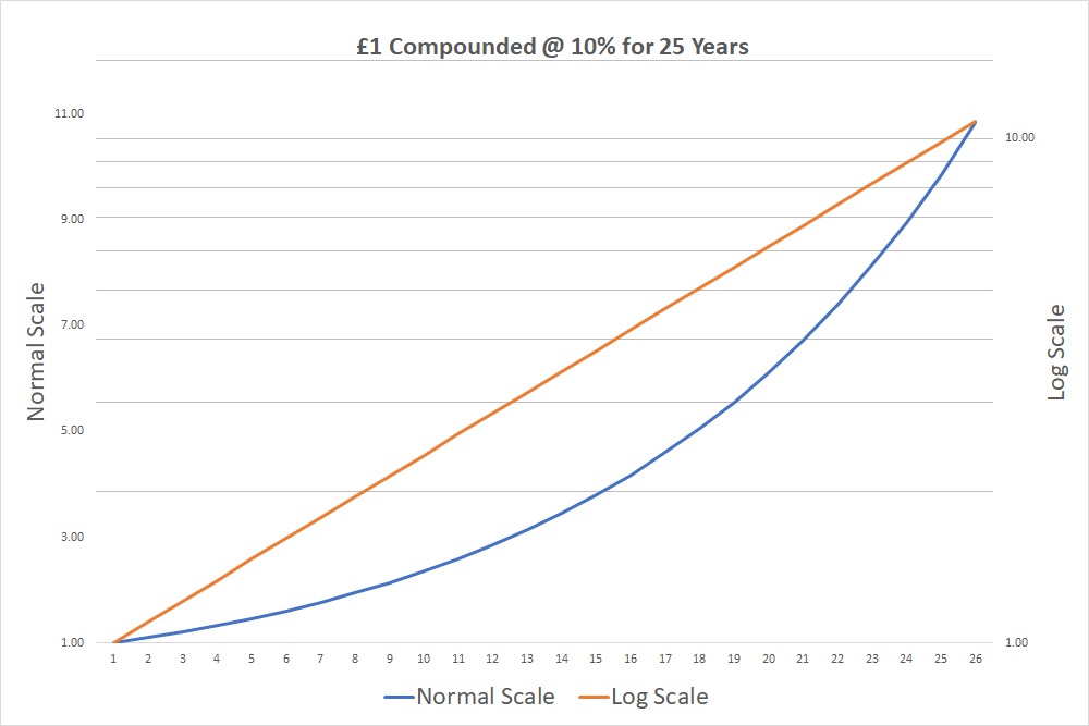
The chart shows what happens if we invest £1 over 25 years and make a 10% CAGR. Our money grows to almost £11 which is where both lines end up.
The blue line is on the left-hand scale and is a normal scale going up in regular amounts of 2 so: 1, 3, 5 etc. The problem is, it looks like we’re getting better and better over time with the line going up exponentially as compounding works its magic. Sadly, we’re not getting better it’s just that when we start, 10% of £1 is £0.10 but after 25 years 10% of £11 is £1.10. We’re still only making 10% a year, we’re not any better, but the chart makes it look like we are. We really want to see the consistent 10% year after year.
To do this we can toggle on something called a “log-scale” and it gives the orange line, plotted on the right-hand scale. You can see the grid-lines across the chart are not evenly spaced at £2 intervals but get closer and closer so the percentage moves are the same. The orange line shows we’re not getting better, we’re consistent, which is what we would expect as we’re making the same 10% from year to year.
That’s all log-scales do, they convert the data to percentages. This is incredibly powerful over long periods of time as we’ll see in the next chart as it allows us to see consistency. Always try and use a log-scale when looking at investments.
HISTORIC RETURNS: THE S&P500
The US stock market is not the oldest, but it is the biggest and that means there’s a lot of information available. Although the S&P500 was only created in 1957, researchers have gone back and calculated what it would have been for the last 150 years. They have done this on a total return basis which if you remember includes dividends. Such a long period of time allows us to see the big picture and that’s extremely important.
We want to thank Edward McQuarrie and Robert Schiller for their truly great pieces of work which we have used in researching this post. If you want to know more you can look online at McQuarrie’s and Schiller’s websites for more information about how they constructed the indexes.
We’ve taken the value of the S&P500 Total Return Index on the 30th June each year from June 1875 to June 2025 which is 151 values of the index. We pretend we invested $1 in June 1875 and then look and see what happened over the following 150 years. So, what does it show? Well, it’s good news as we can see in the following chart.

The chart is on a log-scale as we’re interested in percentage changes so we can see consistency and it speaks for itself. Please stop and pause for a moment, it’s really, really important to get your head around this chart. It’s not that $1 invested 150 years ago would be worth $700,000 today, it’s the fact that the growth has been consistent. Yes, we can see 2 or 3 exceptions but pretty much decade in, decade out, the stock market has grown and grown with the same rate of growth as it’s not far off a straight line. This means patient investors have been rewarded handsomely.
It’s remarkable how relentless this growth has been given the last 150 years included wars, pandemics, financial crashes, recessions, inflation and all manner of other events. No matter what’s been thrown at it, every single time the US market has got through and has continued its march higher. So, let’s look at the returns in a little more detail.
| Period | Count | Count +ve | % +ve | Avg CAGR | Max CAGR | Min CAGR |
| 1 Year | 150 | 111 | 74% | 11.4% | 134.7% | (62.3%) |
| 5 Years | 146 | 133 | 91% | 9.8% | 33.2% | (16.0%) |
| 10 Years | 141 | 135 | 96% | 9.4% | 21.2% | (2.8%) |
| 15 Years | 136 | 136 | 100% | 9.4% | 18.8% | 0.8% |
| 20 Years | 131 | 131 | 100% | 9.4% | 17.6% | 2.4% |
| 25 Years | 126 | 126 | 100% | 9.5% | 15.7% | 3.8% |
| 50 Years | 101 | 101 | 100% | 9.6% | 13.8% | 4.9% |
| 75 Years | 76 | 76 | 100% | 9.8% | 12.3% | 7.5% |
| 100 Years | 51 | 51 | 100% | 9.6% | 10.8% | 8.1% |
| 125 Years | 26 | 26 | 100% | 9.5% | 10.1% | 9.0% |
| 150 Years | 1 | 1 | 100% | 9.4% | 9.4% | 9.4% |
The first line looks at 1-year periods and there were 150 of them. The second line looks at 5-year periods, for example the 5 years ending Jun 2025, the 5 years ending June 2024 etc all the way back to the 5 years ending June 1880 and there were 146 of them. So, 5-year periods show what would have happened if you had invested over any 5-year period in the last 150 years. The third line looks at 10-year periods etc. All returns are CAGRs so we can compare across different investment periods.
There were 150 one-year periods with 111 of them giving a positive CAGR so we made money in 74% of them. The average of these 150 periods was a return of 11.4% with the maximum being 134.7% and the minimum being a whopping loss of (62.3%).
We expect the first things that stand out from the table are:
- A loss of (62%) in a single year?
- We could have invested for 10 years and made a CAGR of (2.8%) so a loss?
- After 25 years we might only have made a 3.8% CAGR?
The problem is that human nature draws us to the negative extremes. The main causes of the poor numbers that stand out are just three events which you can research if you want to and they are: the stock market crash in 1929; the bursting of the Dot Com bubble in the early 2000’s and the Financial Crisis in 2008. Just three events shape how we view an otherwise spectacular history and to be honest, if you remove the 1929 crash then things look completely different as it was such a huge economic shock. These events happened though so we’ll not remove them as it’s important to understand history, good and bad.
Let’s look at a key result we should focus on which is that as the investment period increases, things get better and better. Whilst only 74% of 1-year periods produced a positive CAGR, when we look at periods of 15 years or longer it’s 100%. That’s right, over the last 150 years, all periods that were longer than 15 years would have resulted in us making money and the results include those three huge shocks. It doesn’t matter when you would have started investing, you would have made money after 15 years.
The volatility is huge for 1-year periods with returns ranging from +134.7% to a loss of (62.3%). Again, this is driven by the 1929 crash but the noise calms down dramatically as the holding period increases. When we get to investing for 100 years (our plan is estimated to take 80 – 120 years) then the range of CAGR collapses to between 8.1% and 10.8% with an average of 9.6%.
This is exactly what we were talking about in post “2.4 Risk & Volatility.” In the short term, volatility presents the biggest risk to us not being able to afford the things we want but in the long term it’s inflation. Over the long term our worst outcome if we had invested for 100 years would have been a CAGR of 8.1% which comfortably beats inflation.
Let’s look at this another way:
| Start Years | Date | CAGR |
| 5 | 2020.06 | 15.9% |
| 10 | 2015.06 | 13.1% |
| 15 | 2010.06 | 14.2% |
| 20 | 2005.06 | 10.5% |
| 25 | 2000.06 | 7.8% |
| 50 | 1975.06 | 11.6% |
| 75 | 1950.06 | 11.4% |
| 100 | 1925.06 | 10.5% |
| 125 | 1900.06 | 10.0% |
| 150 | 1875.06 | 9.4% |
If we had started investing 5 years ago in June 2020, we would have made a 15.9% CAGR by the end of June this year. If we had started investing 50 years ago in June 1975 we would have made a 11.6% CAGR by the end of June this year. That’s 11.6% compounded for 50 years when inflation has been around 4%. The poor result over 25 years of 7.8% is because if you had invested in June 2000, you would have invested at the top of the Dot Com bubble just before it burst. None the less, the patient investor would still have made 7.6% despite investing at one of the worst times in history.
Please look at the 150-year chart again, it shows a relentless march higher meaning that stock markets have historically rewarded the patient investor.
HISTORIC RETURNS: THE CRAZY FUND
We’re not investing just in the S&P500 though, we’re being more active and are trying to find investments that might out-perform. The Crazy Fund highlights 10 investments to research and rebalances them annually back to equal weights. So, what do they look like?

The chart shows what would have happened if we invested $1 into the S&P500 and $1 into The Crazy fund 10 years ago and the results are:
- 11.6% CAGR for the S&P500 without dividends
- 17.6% CAGR for The Crazy Fund without dividends (rebalanced annually)
In the last section we saw the S&P500 returned 13.1% with dividends over the last 10 years so dividends of around 1.5% a year. The Crazy Fund does not receive many dividends, only around 0.5%, so if we add those on we get a CAGR of around 18.1% which is 5% more than the S&P500.
A huge word of caution here. This is backward-looking as we did not buy those investments 10 years ago and there is absolutely nothing to say that this out performance will continue. Also, there is no reason that stocks will continue to make a 10% CAGR going forwards but the signs are encouraging with 150 years of data.
CONCLUSION – WHAT CAGR TO EXPECT
We have only looked at the US market for long-term returns as it’s the longest data set available. Looking at European markets on a Total Return basis over the last 50 years or so we see the same relentless march higher decade in, decade out. It’s important to look at total return as we don’t care where the wealth comes from be it dividends or capital gains, we’re just interested in the total return we would have earned as an investor.
So, we have three CAGRs to consider when thinking about what return we can expect:
- 10% CAGR – the S&P500 return over the last 150 years
- 15% CAGR – The Crazy Fund’s 5% extra return over the S&P500 for the last 10 years
- 20% CAGR – the return Warren Buffet has made over 70+ years.
150 years of history is an extremely long time, especially given it shows a relentless march higher. We’re not going to go against that sort of history and so our base case is a 10% CAGR as we’re investing for decades.
Can we do better? We’re using an estimate of 15% at the moment which is the 10% long run S&P500 return plus the 5% extra return The Crazy Fund has shown over the last 10 years. We’ll lower this based on our actual results if we need to. We don’t expect to achieve Warren Buffett’s 20%, certainly not decade in, decade out.
Back in post “1.3 CAGR & Crazy Plans” we used these three CAGRs of 10%, 15% and 20% to estimate how long it will take to reach $1 billion. Hopefully you can now see where these numbers come from. Take a look at the table in that post again and perhaps now our plan is not quite so crazy after all.
THE INVESTMENT REPORT
For an explanation of The Investment Report and The Crazy Fund please see our post “1.1 The Deep End”
| Thu 31-Jul-25 | Monthly Plan | Lumpsum Plan |
| Cash last month £ | 307 | 0 |
| Cash Saved £ | 50 | 0 |
| Unit buys / sells £ | (307) | 0 |
| Total Cash £ | 50 | 0 |
| Units last month | 483 | 10,000 |
| Units bought / sold | 242 | 0 |
| Total Units owned | 725 | 10,000 |
| Unit Price £ | 1.3639 | 1.3639 |
| Fund Value £ | 989 | 13,639 |
| Total Wealth £ | 1,039 | 13,639 |
| FX Rate | 1.3234 | 1.3234 |
| Total Wealth $ | 1,375 | 18,050 |
| Estimated CAGR | 15.00% | 15.00% |
| Years to $1billion | 87yrs 5mths | 78yrs 1mths |
On 01/Jul the Monthly Plan bought 242 units in The Crazy Fund at a unit price of 1.2665 spending all of the £307 that it had saved up. If you need a refresher on investing small amounts of money then please revisit post “1.8 Investing Small Amounts & Correlation” where we detail options for when you can’t afford to buy all the investments you would like. At the end of the month, on 31/Jul, we also saved another £50 into the Monthly Plan.
Yet again, the Lumpsum Plan has done nothing but that’s not quite true, those on the plan have resisted the temptation to spend for yet another month and this is key to becoming wealthy.
THE CRAZY FUND
| Results | 30-Jun-25 | 31-Jul-25 | MTD Move | YTD Move | LTD Move |
| Unit Price £ | 1.2649 | 1.3639 | 7.83% | 6.59% | 36.39% |
| FX Rate | 1.3726 | 1.3234 | (3.59%) | 5.76% | 4.02% |
| Unit Price $ | 1.7362 | 1.8050 | 3.97% | 12.73% | 41.87% |
| CAGR £ | 16.99% | 21.67% | 4.68% | (6.23%) | 21.67% |
It was a great month with our investments making almost 8% and we have hit a new high for the value of The Crazy Fund. The unit price finished the month at 1.3639 and the recovery from the sell-off earlier in the year has been remarkably quick. The FX rate to see what we’re worth in USD has hit us hard this month, moving 3.5% against us, but we’re on plan at the moment as the green line shows.
Below is a table of what the fund is invested in at 31/Jul:
| Ticker | % Fund | Price | CCY | Type | Description |
| LON:IEM | 9.7% | 400.00 | GBP | IT | Impax Environmental Markets PLC |
| LON:SMT | 10.1% | 1,098.00 | GBP | IT | Scottish Mortgage Investment Trust PLC |
| LON:XDEM | 10.0% | 5,767.50 | GBP | ETF | DB X-Trackers MSCI World Momentum Factor UCITS |
| LON:ATT | 10.4% | 470.50 | GBP | IT | Allianz Technology Trust PLC |
| LON:IITU | 10.4% | 2,912.00 | GBP | ETF | iShares S&P 500 Information Technology |
| LON:PCT | 10.7% | 402.00 | GBP | IT | Polar Capital Technology Trust PLC |
| LON:XDWT | 10.1% | 108.13 | USD | ETF | Xtrackers MSCI World Information Technology UCITS |
| LON:CSP1 | 9.7% | 51,500.00 | GBP | ETF | iShares Core S&P 500 UCITS (Acc) GBP Hedged |
| LON:EQQQ | 9.8% | 43,286.00 | GBP | ETF | Invesco NASDAQ 100 UCITS GBP Hedged |
| LON:JAM | 9.1% | 1,084.00 | GBP | IT | JP Morgan American Investment Trust PLC |
| Shares | 99.8% | ||||
| Cash | 0.2% |
There were no dividends in the month and no changes to our investments.
A FAVOUR
*** Please Subscribe!
If you find our posts helpful in building a bright financial future then in exchange, please sign up to receive them by email. The more people that subscribe the more we grow which means we can create more content to help you become unimaginably wealthy. You can sign up using the subscribe box at the top of our website: https://thecrazyplan.com
*** Please Spread The Word!
This blog is free as we want everyone to have access to financial education. We hope to inspire you to set out on your own journey to a bright financial future and if we do, in return please spread the word to others.
NEXT MONTH
Next month we’re going to look at the volatility of the returns we’ve seen above in a little more detail, in particular the downside volatility. We’ll do this by introducing something called Drawdown and be prepared for a roller-coaster of a post.
DISCLAIMER
Please note that by the time this blog is published, we may no longer own some or any of the investments discussed. Strategies and investments discussed might be totally unsuitable for you and we are not recommending them to you, they should only be considered as ideas for further research. You must read and agree to our Terms & Conditions, including the Disclaimer, which can be found on the T&C page of our website: https://thecrazyplan.com
© TradeFloor Promotions Limited 2025
